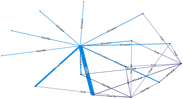
Relationship mapping helps identify natural clusters of constituent characteristics, which can then be used to form segmented solicitation efforts. In other words, moving from a “September direct mail” campaign to an “Online donors who give in September to the computer lab” campaign would help us connect much more personally to members of our audience.
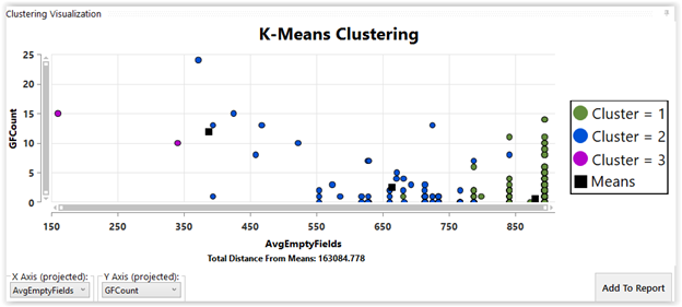
In the Water Cooler Chat, I showed the machine learning technique, cluster analysis. Here is the illustration from my presentation.
First, every data exercise starts with data. Let’s say that we have this data on last year’s annual giving program:
ID
Month of last gift date
Last fund given to
Last solicitation method given to
Gift amount
What can we learn by using NodeXL’s relationship mapping exercise? Can we identify clusters of giving behaviors?
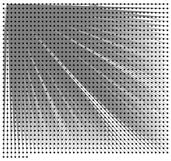
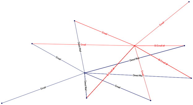
First, we would load the data into NodeXL. Below I show a made-up data set loaded into NodeXL, and created my first graph, which didn’t tell me much:
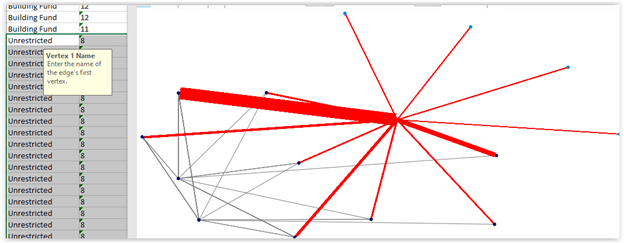
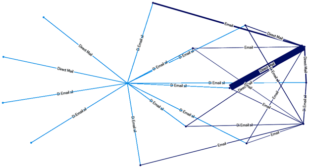
When I recolor the graph to represent the average gift amount, I get higher gifts from direct mail to the Building Fund. See this next graph.
Have we shown sentiment? Yes. We’ve shown that email donors are responding to unrestricted appeals and that specific fund donors like to be solicited in a more personal way, even if that is only a direct mail piece.
Imagine if our 4 pieces of data included posts responded to or liked, key words from those posts, or count of events attended before the gift. What will you find?
Give it a try! And I hope that you will share your results with us.
