In our recent Water Cooler Chat, we talked about using IRS data to understand charitable giving among US residents. Of course, that afforded me an opportunity to make lots of graphs and charts to study this data more deeply. Here is a look at some interesting statistics related to different US states.
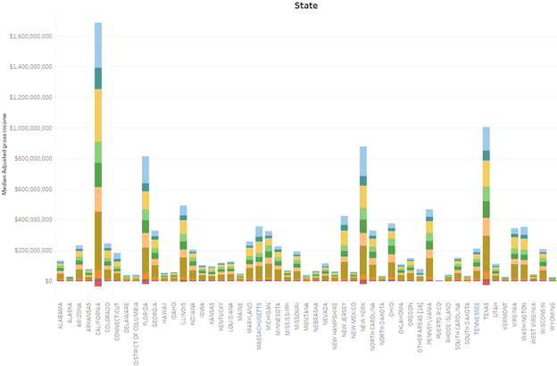
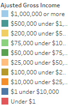
First, notice in this graph that California, Texas, and New York all have the highest levels of median income, but are also the states where people claimed a negative adjusted gross income (see how the little red boxes drop below zero).
First, notice in this graph that California, Texas, and New York all have the highest levels of median income, but are also the states where people claimed a negative adjusted gross income (see how the little red boxes drop below zero).
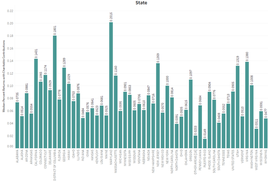
However, the largest number of tax payers taking a charitable gift deduction is apparently Maryland. This graph shows the median percentage of the number of returns from each state with deductions for charitable contributions.
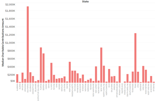
However, California, Texas, and New York take the prize for the most generous median total giving:
My first reaction to these results is that gift officers should travel to California, Texas, and New York regularly if they have prospects there. Also, since this is 2019 data, Texas may have seen a drop in incomes in 2020 and 2021 when the pandemic took a lot of us off the road – oil and gas have not fared well.
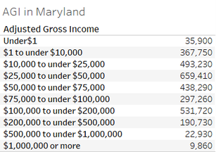
My second reaction is to wonder about the Maryland result. Let’s take a look at the distribution of AGI for the state.
My second reaction is to wonder about the Maryland result. Let’s take a look at the distribution of AGI for the state.
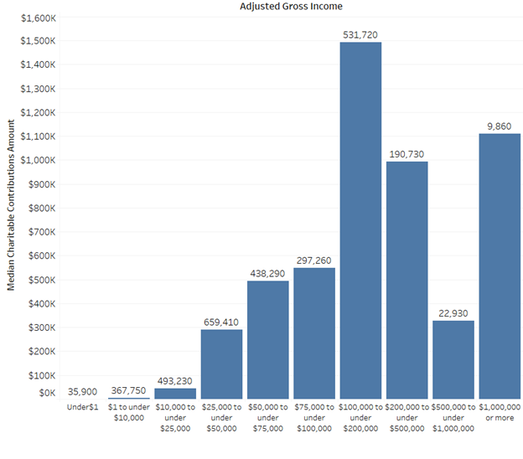
Wait – let’s take a look at giving and return counts.
The numbers on top of the chart are the counts of tax returns at those levels. Notice that the highest count is $25K to $50K, but the highest median contributions deduction is from among professionals earning $100K to $200K. This income level represents leadership annual giving prospects – what would be a good local way to cultivate this population?
If you do these charts for your own state, what do you see?
For comments and questions, email me at marianne@staupell.com

